
- ABOUT US
- PROGRAM AREAS
- CONSERVATION APPROACH
- EDUCATION
- MULTIMEDIA
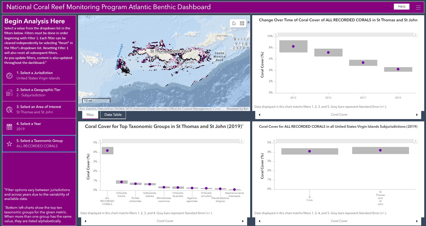
- Coral cover of all recorded corals has declined from 2013-2019 in the combined area of St. Thomas and St. John, USVI, from ~ 8% in 2013 to ~4% in 2019.
- Coral cover for certain individual species was very low (~1%) in 2019 in this area.
- Coral cover of all recorded corals in 2019 for both St. Croix and St. Thomas/St. John was around 4%.
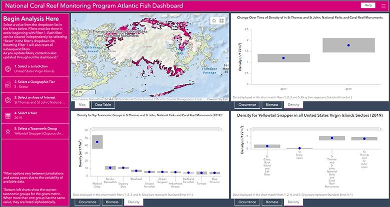
- Density of yellowtail snapper in the parks/monuments in the combined St. Thomas and St. John area may have slightly increased from 2017 to 2019.
- The fish with the highest density in the parks/monuments in this area in 2019 was the masked goby.
- Density of yellowtail snappers appears to be higher in this combined area of St. Thomas and St. Thomas than in St. Croix in 2019, regardless of whether the site is in a protected area.
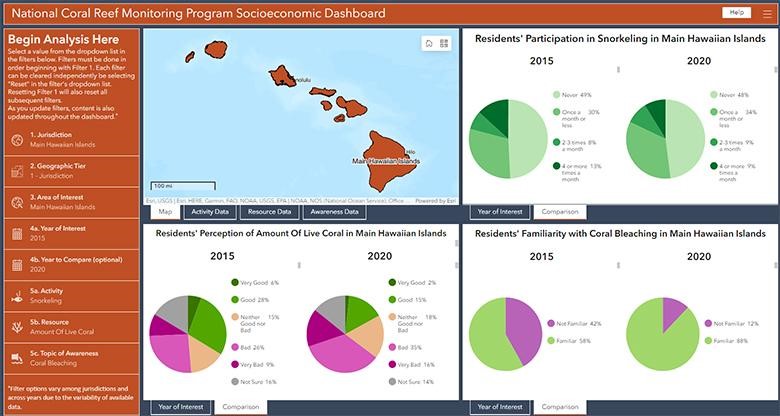
- Residents' participation rates in snorkeling remained largely unchanged between 2015 and 2020, and many residents in both survey cycles self-reported that they never snorkel.
- Residents’ perception of the amount of live coral in Hawai’i varied in both cycles, but the percentage of residents who said the amount of coral was bad or very bad increased between 2015 and 2020.
- In 2015, 58% of residents said they were familiar with coral bleaching as a threat to coral reefs, and in 2020, 88% of residents said they were familiar with coral bleaching.
NOAA unveils new tool for exploring national coral reef monitoring data
By: Erica K. Towle, Ph.D., National Coral Reef Monitoring Program Coordinator
Takeaway: NOAA’s National Coral Reef Monitoring Program (NCRMP) launched a new data visualization tool on NOAA's Geoplatform for shallow tropical coral reef ecosystem data, which provides free and easy-to-access information on the status and trends of U.S. coral reefs.
View an audio description version.
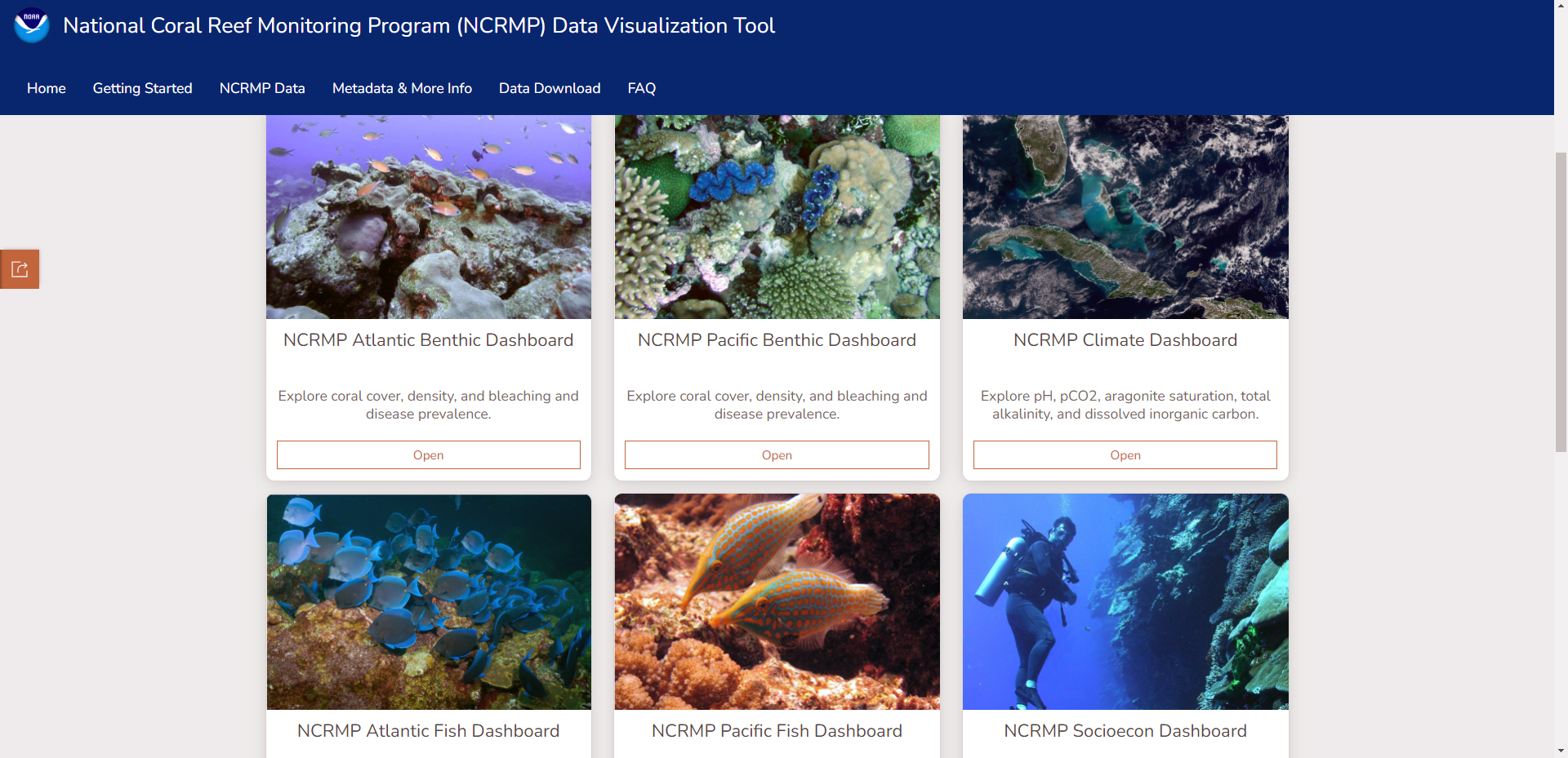
The NCRMP Data Visualization Tool is the first tool focusing on shallow tropical coral reef data to be hosted on the NOAA Geoplatform, which is NOAA’s central hub for geospatial data and tools. The tool includes six data dashboards that cover Atlantic benthic, Atlantic fish, Pacific benthic, Pacific fish, Climate, and Socioeconomic data. The primary audiences for the data visualization tool are natural resource managers and stakeholders in the coral reef conservation community. However, we hope other user groups, like students in academia, may also find this tool useful.

NOAA's National Coral Reef Monitoring Program (NCRMP) is the nation's premier coral reef ecosystem monitoring program, collecting data in all ten U.S. states and territories in the Atlantic, Caribbean, Gulf of Mexico, and Pacific Islands that have tropical coral reef resources. NCRMP is progressive and unique in that it is one of the few coral reef monitoring programs in the world to integrate a human dimensions component with biophysical monitoring. The resulting data provide a robust picture of the condition of U.S. coral reef ecosystems and the communities connected to them.
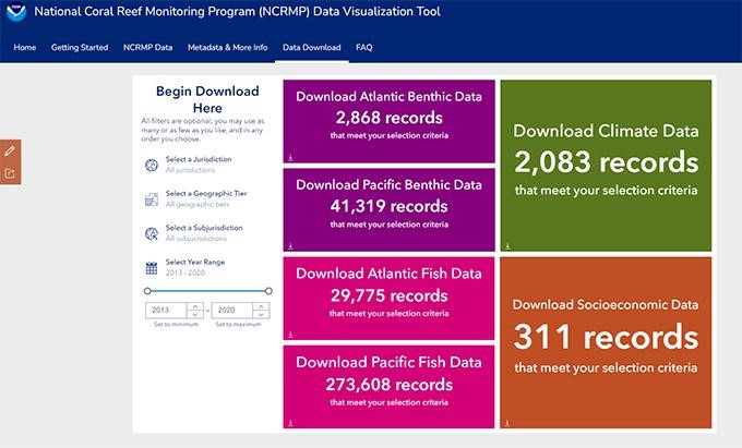
Accessing data is a key component of this new visualization tool. For the first time, users can download streamlined data summaries for each available year at different geographic scales. Users asked for and received ways to filter and download data in an easy-to-understand format, allowing researchers and decision-makers to develop custom datasets with actionable, situation-specific information.
The tool allows a user to select a geographic area and a timeframe, as well as a species or data variable of interest, and the dashboard displays the data available graphically, allowing the user to get a snapshot of what is happening based on the filters they selected. A user can take a screenshot of the graphs and use them in presentations, or cite them in reports. There are separate dashboards for benthic, fish, climate, and socioeconomic data in order to make the tool as user-friendly as possible. Below, you can get a taste of what each dashboard has to offer! The benthic, fish, and climate examples below are from the U.S. Virgin Islands, and the socioeconomic example is from Hawai'i.
Benthic example
For this example, the filters on the left hand side are set to choose the jurisdiction (U.S. Virgin Islands), the tier (subjurisdiction), the specific area of interest (St. Thomas and St. John), and the year (2019). Finally, the species observed is set to all recorded corals combined.
The dashboard shows a map (upper left) and then three different figures: change over time (temporal), top taxonomic groups, and spatial comparison. This example shows coral cover but users can scroll at the bottom of each figure for other metrics such as macroalgae cover, coral density, bleaching prevalence, and disease prevalence.
As a result of this filtering, the data show that:
Fish example
For this example, the filters on the left hand side are set to select the jurisdiction (U.S. Virgin Islands), the tier (sector), and the area of interest (St. Thomas and St. John, National Parks and Coral Reef Monuments). These selections configure the tool to compare specific management areas instead of the entire sampling area. Next, the year (2019) and the specific fish species (yellowtail snapper) are also selected.
The dashboard shows a map (upper left) and then three different figures just like on the benthic dashboard: change over time (temporal), top taxonomic groups, and spatial comparison. The tool displays density now, but users can scroll at the bottom of each figure for other metrics such as occurrence and biomass.
As a result of this filtering, the data show that:
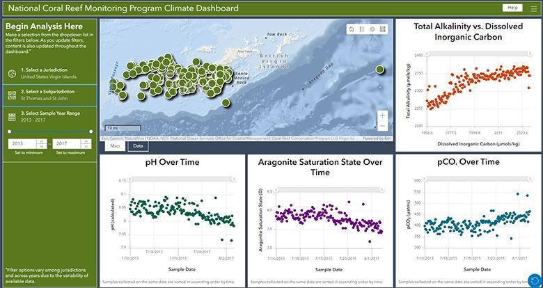
Climate example
The filters are displayed on the left side of the screen again, just like on the other dashboards, but there are only three filters on the climate dashboard. For this example, the filters are set to select the jurisdiction (U.S. Virgin Islands), the tier (St. Thomas and St. John), and the year range (2013-2017).
The dashboard shows a map (upper left) and then four different figures - TA vs DIC, pH over time, aragonite saturation state over time, and pCO2 over time. In this example, the tool displays point data (not means), but users can see that there does seem to be a trend of slight decreases in pH and aragonite saturation state over time, and slight increases in pCO2 over time.
Socioeconomic example
The filters are, again, displayed on the left side of the screen. This dashboard has the most filter options. For this example, the filters are set to select the jurisdiction (Hawai’i), the tier (jurisdiction), the area of interest (Main Hawaiian Islands) and the year (2015, because that was the first survey year). Next, 2020 is selected as the year to compare against the 2015 data. The last step was to select what activities, resources, and topics of awareness to visualize (residents’ participation in snorkeling, residents’ perception about the amount of live coral, and residents’ awareness about coral bleaching). The dashboard shows a map (upper left) and then three different figures - one for each of the survey category questions selected.
Based on the filtering selected, the data show that:
Data Download
One of the best parts of the tool is that it has a direct data download feature. Of course, people could download raw NCRMP data previously, but this tool offers a new option for the first time. The tool allows a user to download data that has already been summarized at various spatial levels, so it’s easier than ever to get more customized, analysis-ready data.
In addition to all the data dashboards and download, the tool has supporting material that will improve how users can find NCRMP methods, protocols, and metadata, too. We hope this site becomes a new one-stop-shop for all things related to NCRMP data!
This tool would not have been possible without support from the Coral Reef Conservation Program, our partners at NV5 Geospatial, the Coral Reef Information System (CoRIS) team, the NCRMP team leads and data analysts, and many colleagues who provided feedback to improve the tool during its development. NCRMP’s new data visualization tool is a portal into NOAA’s vast portfolio of information on coral reef status and trends, and a powerful tool in ongoing efforts to conserve these remarkable and fragile ecosystems.
For questions, please contact Erica.Towle@noaa.gov
Related Stories and Products
About Us

The NOAA Coral Reef Conservation Program was established in 2000 by the Coral Reef Conservation Act. Headquartered in Silver Spring, Maryland, the program is part of NOAA's Office for Coastal Management.
The Coral Reef Information System (CoRIS) is the program's information portal that provides access to NOAA coral reef data and products.
Work With US
U.S. Coral Reef Task Force
Funding Opportunities
Employment
Fellowship Program
Contracting Assistance
Graphic Identifier
Featured Stories Archive
Access the archive of featured stories here...
Feedback
Thank you for visiting NOAA’s Coral Reef Conservation Program online. Please take our website satisfaction survey. We welcome your ideas, comments, and feedback. Questions? Email coralreef@noaa.gov.
Stay Connected
Contact Us
NOAA’s Coral Reef Conservation Program
SSMC4, 10th Floor
1305 East West Highway
Silver Spring, MD 20910
coralreef@noaa.gov